| #40 | 2/17/10 | #8 |
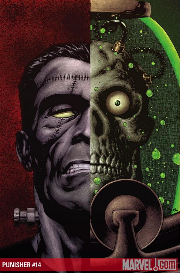
PUNISHER #14: FRANKENCASTLE
Writer: Rick Remender Art: Dan Brereton & Tony Moore Publisher: Marvel Comics Reviewer: Mr. Pasty
Straight from the files of “I didn’t see that coming” is PUNISHER’s latest FRANKENCASTLE offering. I actually splurged on this one because after a rare string of back-to-back reviews that were more praise than paste, I felt the urge to buy a substandard book and turn it inside-out with another patented dose of venomous prose. As luck would have it, it’s now three straight weeks of happy little trees. Damn you, Rick Remender!Sure, I had heard the horror stories about the abortion that was FRANKENCASTLE, but I don’t think it was my lowered expectations that made this such a pleasant read. Instead, I believe it was the fact that 90 percent of this book ignores FRANKENCASTLE to focus on an extended flashback that builds a story around a 19th century man and his life as a monster hunter. This comic reads like a “Darkstalkers” video game. Werewolves, vampires, zombies, bizarre creatures, it’s all here. But the strength is in the narrative. Remender does a great job of fleshing out the antagonist and making him more than just your average cookie-cutter villain – assuming you even want to see him in that light. Are there really good guys and bad guys in a world inhabited by ghouls and ghosts? It would seem more like “every man for himself.” In any event, Franky appears at both the beginning and at the end of the story but this comic could have been a terrific one-shot with absolutely no PUNISHER whatsoever. It’s that good.
I also like how the artists trade brushes for the flashback sequence. The opening and closing panels are your standard cartoony fare, but when the book shifts gears to tell the story of Robert Hellsgaard, the art is laid out with a thick brush boasting rich colors that rise and fall with the action. It was almost dreamlike but effective in its attempt to create a separate world in a time that preceded the opening events. I was actually sorry it had to end. There’s also a cool battle robot that thankfully doesn’t try to be too techy or suffer from being overdrawn. It reminded me a bit of the IRON GIANT in that it’s a fantastic piece of advanced weaponry, but looks like something you could have probably assembled at your local junkyard with the right tools and plenty of free time. I appreciate that balance. So too are the monsters presented in a way that is completely over the top but somehow still endearing.
I guess my only knock on this book is that by the time I was done reading it, I didn’t give two shits about FRANKENCASTLE. I wanted more clunky robots battling undead monsters. Is this book worth the price of admission? Definitely. But I wouldn’t get too comfortable. Now that we’ve gotten all that exposition out of the way we’re bound to get plunged right back into the misadventures of FRANKENCASTLE and his team of techno-twits. Oh well. It was fun while it lasted.
Web heads who can’t get enough of Mr. Pasty’s word vomit are encouraged to watch him operate as Nostradumbass over at here. MMAmania.com. Love, hate and Mafia Wars requests should be directed here.

SCI FI & FANTASY ILLUSTRATED #1
Written by: Joe Brusha Art by: Claudio Sepulveda Published by: Zenescope Entertainment Reviewed by: Irish Rican
Zenescope is well known for their GRIMM FAIRY TALE titles that they do so well. I do like when they branch out and try other genres which is why SCI FI & FANTASY ILLUSTRATED, while being a mouthful to say, interested me.The plot for this issue is awesome and my personal dream: the robot sex girl. Philip J. Fry had a Lucy Liu one in the future and the Japanese are working on the RIGHT NOW - WOOHOO Science Faction!
In SF&FI, Andy is a geeky guy who just moved to the city. He has no friends, he hasn't gone on any dates, and when he attempts to bond with the female types they shoot him down with your typical "Sorry, I have a date with my vibrator" responses.
So when a commercial pops up for Lifemate, hottie sex robot dolls who don't ask you to clean up after yourself or cuddle, Andy knows he is IN! One visit to Lifemate and a week later, the big box arrives and Debbie the robot redhead pops on out. She cooks! She cleans! She'll rock your world until your six minutes are done! She's like the perfect girlfriend!
Except in Andy's case. He wants, like, conversation or something! He wants to know "what the robot thinks!" I say who cares what she thinks...but I'm not starring in the story (note to Zenescope: You can use me in a future story...even if I don't get a hot robot sex doll).
So the story truly begins when Andy inevitably finds a girl he likes in Samantha, a cutie who he can talk to and actually digs the poor nerd. So what happens now? What happens when you try balancing a girlfriend out in the world and your redhead sex robot at home? If you are thinking, Hey! THREESOME!" you're wrong.
A power punch of a comic book, SCI FI & FANTASY ILLUSTRATED was an electrifying read and a more than welcome addition to the Zenescope stable. Joe Brusha's story was truly right up my alley and Claudio Sepulveda's art is simply astounding. It really makes me wish for a psycho sex doll of my own...
Ryan McLelland AKA Irish Rican has worked in movies and comics journalism for the past several years before joining the @$$holes here at AICN. Ryan’s comic work has already graced comic shelves with Arcana’s PHILLY, WISE INTELLIGENCE, UPTOWN GIRL, and THE SENTINELS ANTHOLOGY. He rarely updates his blog but when he does it can be read at www.eyewannabe.com. The first issue of his new WISE INTELLIGENCE miniseries can be found here.

GREEN LANTERN #51
Writer: Geoff Johns Artist: Doug Mahnke
GREEN LANTERN CORPS #45
Writer: Peter Tomasi Artist: Patrick Gleason Publisher: DC Comics Reviewer: Optimous Douche
I’m going to make a prediction, and even if my crystal ball has more clouds than clarity this is a belief I hold to the core of my being: Geoff Johns will one day helm the DC comic line as Editor-in-Chief (if he so chooses).We’ll look past his deep reverence for the DC universe past and present, which he has. Nor am I basing this prediction on the fact he is an exceptional writer, which he is. No, this prediction is based solely on how tightly he has woven together the disparate titles of BLACKEST NIGHT to deliver not only an exhilarating tale, but one in which the parts are as great as or greater than the sum. The exceptional craftsmanship with which he has developed the core titles to deliver the brunt of the story, while keeping the ancillary titles as mere supplemental information for the true zealots, shows not only a respect for us as consumers, but has allowed the entire BLACKEST NIGHT experience to unfold before our eyes instead of being crammed down our throats. Don’t want to read the FLASH, WONDER WOMAN or other minis then don’t; BLACKEST NIGHT will not punish you in the same ways FINAL CRISIS did. That’s an Optimous Douche guarantee.
For Johns’ detractors that like to say he is more talk than action, or more heart than huff, the latest issue of GREEN LANTERN pummels your fanboy nay-saying into a gooey Technicolor paste. You want sheer @$$-kickery, you got it with the battle between the Parallax-infested Hal Jordan and the Black Spectre. I don’t know whether it was the brain child of Johns or Mahnke, but when Parallax grabbed the Spectre’s eyelids and ripped off his face skin to expose a fleshy pulp underneath I believe I wet myself the teeniest bit (why is it so much cuter when girls say that?). Sure the issue isn’t all action, but that placates the older fanboys (like yours truly) that want to see our comics counterbalanced with as much emotion as sheer brute force. I won’t divulge how Hal is finally freed from Parallax’s grip, but it was a sweet and endearing moment that’s been a long time coming in the GREEN LANTERN universe. The pose on the last page with DC’s dead, but not dead, but they soon will be dead again, (or will they?) heroes flanking Nekron perfectly sets the stage for a battle royale as we enter BLACKEST NIGHT’S dénouement. Also, I need to throw out a special kudos for giving Lex Luthor some actual dialogue in this issue and removing the Smigel qualities that bothered me so during his last appearance. If all this wasn’t enough, there’s a final elude that makes my fanman nipples go into full perk – Can you say Hector Hammond, folks?…
While Hal and the New Guardians battle to save Earth, over in the Pacific theater…I mean the battle for OA in GREEN LANTERN CORPS, the Lanterns attempt to save Guy Gardner from the rage of the Red Ring. Guy Gardner along with Booster Gold have been two characters in the DC universe that I can truly say have evolved over time and have not fallen victim to the CRISIS reset button (this is not a challenge, it’s a compliment). To watch these characters grow from second-string, child-like douchebags back in the 80s JUSTICE LEAGUE to central lynch pins of the DC universe makes me covet my back issues where the evolution unfolds. This issue highlights that evolution in perfect style. As Guy undergoes the Mogo bath of rage purification, we see the heartache that shaped the hard exterior of young Guy and the melting of those walls over the years through his love of Ice (and if you think I’m talking about a special kind of blow-job when I say Ice, you need to read more). Naturally Guy is pulled away from the temptations of rage. The final panel serves up an exquisite picture of battle poses as the good guys ready themselves to save OA. It’s a stroke of sameness with the Nekron army stance in GREEN LANTERN that truly pays dividends to those of us that read both titles.
I’ve said it before and I’ll say it for as long as Tomasi and Johns are crafting the space opera portion of the DC Universe: these guys have to be wrapped together in the same snuggie when they write. It’s the only way I can think of that they could actually deliver one of the most concise and compelling crossovers in years.
Optimous is lonely and needs friends. Even virtual ones will fill the gaping hole, join him on Facebook or he will cry like a newborn kitten.
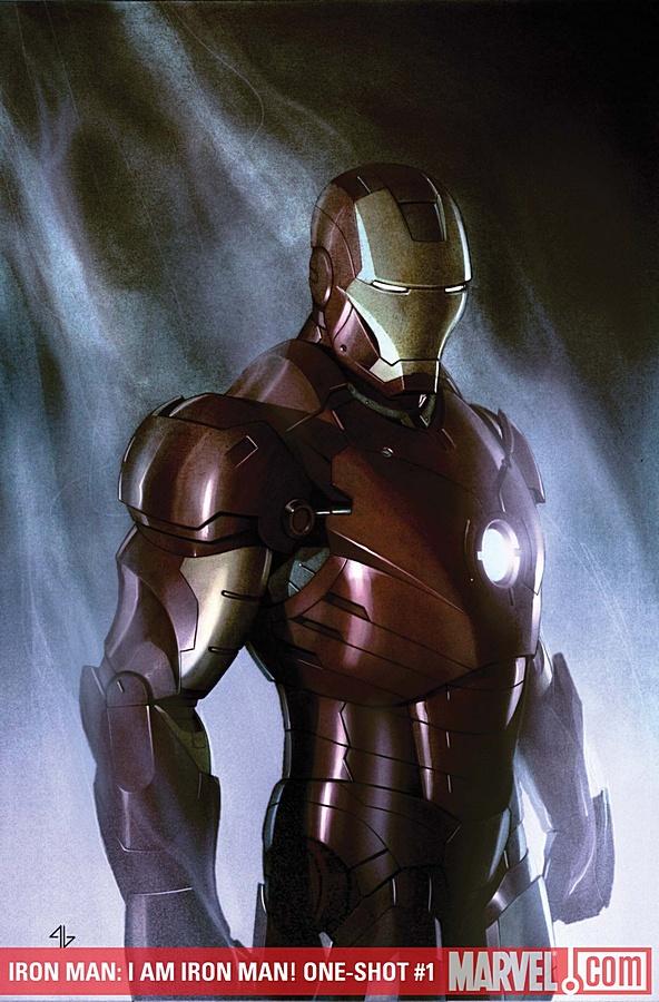
IRON MAN: I AM IRON MAN! #1
Writer: Peter David Artist: Sean Chen & Array Publisher: Marvel Comics Reviewer: William
I picked up this copy because (as with many comic book fans out there) I’m a huge fan of the first movie, and it felt right to be able to finally get this in the format it was originally birthed from.Of course the movie itself was wonderful, truly a breath of fresh air when it came to the recent world of Marvel comic book movies. Coming from a rather bland run consisting of “Daredevil”, “X3”, “Ghost Rider”, “Fantastic Four” and its sequel, this great film from Favreau and Co. provided us fans a whole new venerable and quality franchise to work with. It definitely raised the bar yet again when it comes to the greatness of a comic book film, and thus far remains near the top of my favorite comic book movies, “Superman” (1978) of course being #1. In any case, like everyone else out there I look highly forward to seeing “Iron Man 2”, and hope for the same continued success from this great crew.
Now I already have the novelization of the movie (written by Peter David too), which itself had some nice expanded parts from the movie that the theater of mind allowed to visualize. The purpose of this purchase however was to get another fresh take on the movie itself. Much like viewing something from a different angle, here I got to see how an artist portrayed their own concept of the movie.
Artist Sean Chen does this in an excellent way in my opinion, visualizing the comic much like its movie counterpart while still maintaining his own artistic touch. I haven’t been too much of a fan of his work before (JLA: SALVATION RUN and its simplistic overtones comes to mind), but here his artwork works perfectly. Very crisp and clean looking. His Tony Stark doesn’t look like Robert Downey Jr., but Chen still makes it feel like his movie counterpart nonetheless. Chen (or the colorist) does provide some artistic liberty with Pepper Potts, however, giving her a blondish look rather than her redhead movie/comic counterpart. Chen also decides to give Obadiah Stane a goatee rather than the intimidating beard that Jeff Bridges had in the movie, which in my opinion was Chen‘s only mistake (that full-on beard from Bridges definitely was its own character). I have yet to see how Chen will visualize the showdown between Iron Man and the Iron Monger, as that happens in issue #2, but based on what I’ve seen from his artwork I look forward to it.
The writing from Peter David…well, I guess it’s as good as can be when someone simply transposes it from script to comic. While in the novelization he was able to expand as much as he wanted, here he actually had to clip things out of the movie itself in order to have it fit within the 22 pages allotted.
If you’re a fan of the film I recommend this for your collection, if anything else to at least get it in its proper format. Of if you know anyone else out there, friend or family member, who’s also a fan, this would be a great and cheap gift for them as well.
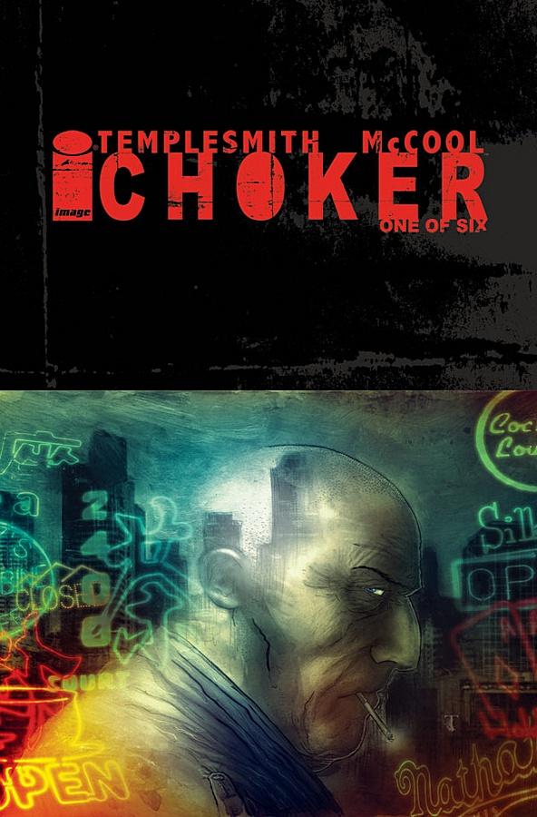
CHOKER #1
Writer: Ben McCool Artist: Ben Templesmith Publisher: Image Comics Reviewed by Humphrey Lee
CHOKER represents three things I enjoy immensely: A gumshoe story, a K. Dickian setting for it (which I did not even really know that was going to be the case when I pre-ordered this so, y’know, bonus) and Ben Templesmith art. And if that’s your bag, then CHOKER delivers…mostly. And here’s where I break it down.To go with two of those three elements above, the art is gorgeous and the setting is very exciting. Templesmith’s art style already has that aura of “eeriness” that is perfect for a book like this, as we learned with FELL. The random fucked up imagery, like a man with five heads having three of them lay dead by mutilation, could only come from his work table. It’s just a culmination of everything here, from his character models to the coloring, to all the little snippets you catch in the panels that make up this world, that is what really drives the book - the art and the atmosphere it conveys - and it is glorious.
The other aspect of the comic, the gumshoe tale, actually takes kind of a backseat to the other parts of the whole. We do spend a lot of time with our lead, Johnny Jackson, and get into his mindset, but the story established around him is somewhat bare. Basically over twenty of the twenty-two pages we discover he’s a bit of a miserable fuck – and who would have it any other way in this kind of tale, really – who used to be a pig before he was a dick and would really like to go back to the old ways. So, of course, this story is about a case that falls into his lap that could get him back on the force. Solidly executed, but a little standby, which is why I say this issue is dominated by the art end of the two Bens and the imagery he brings to the table. Having that development being the focus of the entire issue leaves this debut issue a little light in the non-visual storytelling area, or at least that’s how I felt.
Again, this book does ooze the attitude and there is a lot to look forward to, especially now that the “formalities” are done. We have a bit of knowledge of our main character and how he works, and whatever it was that happened in his past that cost him his job and life will be a nice thread to have developed. And, best of all, we know that this is a fucked up, LSD soaked copy of the world where anything can and does happen, so it should be a thrill to watch open up as well. Going into this with no expectations other than Templesmith art, I must say I now have a lot of enthusiasm built up for what the duo of Bens together will be bringing to the Dick table, take that as you will.
Humphrey Lee has been an avid comic book reader going on fifteen years now and a contributor to Ain't It Cool comics for quite a few as well. In fact, reading comics is about all he does in his free time and where all the money from his day job wages goes to - funding his comic book habit so he can talk about them to you, our loyal readers (lucky you). He's a bit of a social networking whore, so you can find him all over the Interwebs on sites like Twitter, The MySpaces, Facebookand a Blogger Account where he also mostly talks about comics with his free time because he hasn't the slightest semblance of a life. Sad but true, and he gladly encourages you to add, read, and comment as you will.
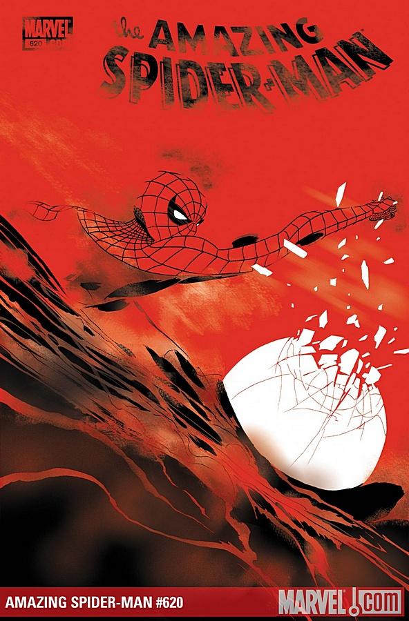
AMAZING SPIDER-MAN #620
Writer: Dan Slott Artist: Marcos Martin Publisher: Marvel Comics Reviewer: KletusCasady
I am nursing a wicked hangover; thus, I decided to do the unthinkable: “never drink again?” you ask. No, in fact I’m planning my next alcoholic beverage as we speak. I am going to review a Spider-Man comic and not even mention “One More Day”. Pssssssh Yeah right!I love Spider-man…I mean LOVE Spider-Man ask anyone who knows me. I have everyone from the girlfriend, to my Grandmother, to my boss buying me random Spider-Man shit and I love it all. I hope to have a room dedicated to the old Web Head one day….one day. I even have two Spider-man tattoos and I plan to get more. Basically, Spider-Man is my favorite comic book character of all time and always will be {sniff} {sniff} sorry, I started to tear up. Between the costume, the quips, the abilities and Peter Parker’s downtrodden life that mirrors my own in some ways, I just can’t get enough. I will read AMAZING SPIDER-MAN until the day I die!!!!!!!!! Ok, I think you get the point. I believe there are a lot of other people that feel this way and some that are even more passionate about Spider-Man than I am. Even after “One More Day”, I continue to read but something feels off to me. I won’t talk about this at length but it is directly related to “One More Day”. Because in order to enjoy these stories you HAVE to accept that “One More Day” happened and that is kind of a big pill to swallow. “One More Day” wasn’t the worst Spider-Man story I’ve ever read (I’m looking at you SPIDER-MAN: THE OTHER…however WHAT IF?: THE OTHER is fucking excellent if you haven’t read it, find it and do so). It’s really the reasoning behind it all that doesn’t sit well with me and the excuse that there were “no more good stories to be told with a married Pete” is bullshit and kind of an insult to the writers at Marvel. Matt Fraction or Dan Slott could have knocked that shit out of the park and you know it! (I’m not sure who YOU is but I still have a light buzz and feel like yelling at someone). Also, deciding that Peter Parker isn’t interesting married isn’t something editorial should be deciding for the readers that should be left up to us. RANT COMPLETE.
I don’t really have a problem with any one particular writer or artist on SPIDER-MAN right now (coincidentally my favorites, Slott and Martin, are on this issue). The problem I have is that each person that comes on to write a story arc has a different approach to Spider-Man and with the artists changing all the time, it gives the comic a disjointed feel. No story arc feels like a smooth transition from one to the other. What I mean by this is that it’s like coming to your house and finding out someone has rearranged your furniture; it’s still your house, all the same things are there but something is different and you can immediately tell. Say what you will about J. Michael Straczynnski, but he had a singular vision for Spider-Man and every time you picked up the book everything felt like it was in the same place. Now this has a lot to do with the same artist (John Romita Jr) being on the book, but the different styles of writing contributes to the lack of a consistent feel throughout the book. I just wish that they would pick one guy (Slott) and one artist (Martin or Romita) and just stick with them. I mean, sure, have an issue here or there by someone else but keep the art consistent for God’s sake (ohh I’m gonna get a Burrito for lunch...Mmmm…sorry hangover munchies). I realize this might be hard because of the three times a month thing, which is really just causing my lazy ass to get behind really easily, but reduce it to two to times a month if you have to. As much as I love Spidey, I don’t HAVE to have him shoved down my throat three times a month (mmm...burrito). I think, above all, Slott has written the best Spidey-Man arcs (“New Ways to Die”, the First arc with McNiven on art, the Mysterio Gauntlet issues, Paper Doll, etc.) and he’s actually a funny guy in real life; so keep him. Marcos Martin might be my second favorite to John Romita Jr. for the more recent Spider-Man artists, his shit (sorry about the cursing, it’s the buzz) is soooo perfect for Spider-Man. He draws him like I imagine him, kind of awkward looking, limber, not too muscular but fit and he’s barely ever on the ground. Plus, the shots of Spider-Man moving through a page with multiple Spider-Mans on the page to show his speed is awesome to me (see previous issue).
Look, if you like Spider-Man, these are good stories with good art and everyone involved genuinely seems as though they want Spider-Man comics to do well. It just sucks that they have to come after a story arc that pissed off damn near half of all the readers so bad that they dropped the book (at least that’s what happened at my store). The reason people can’t forget about “One More Day” is because a lot of the characters (Harry, single Pete and MJ, etc.) are in their current situations because of an ill conceived plan to “revamp” Spidey. People see that and are taken out of the story and much like my headache, keeps returning to that infamous moment sort of like when I think about why the hell I had that last pitcher when I knew I had to get up at 8am. This last story arc was pretty good with solid writing, stellar art and Mysterio is still one of Spider-Man’s more interesting villains (see OLD MAN LOGAN). I just wish AMAZING SPIDER-MAN had a more consistent feel and that I could read it without thinking of an editorial mandate. Now, I’m off to find a burrito and throw up in the bathroom.

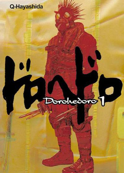
DOROHEDORO Volume 01
By Q Hayashida Released by Viz Media Also Serialized on SigikkiReviewer: Scott Green
In honor of all of the Oscar nominations for Kathryn Bigelow's HURT LOCKER, check out the very strange, very violent manga DOROHEDORO. The identity of its creator is interesting in a couple of respects. Q Hayashida was an assistant to much talked about cyber-horror stand out Tsutomu Nihei (BLAME!, more recently BIOMEGA). And, though you probably couldn't guess from the moniker or grisly work, Q Hayashida is a woman.DOROHEDORO is set in "the Hole," a slum hunting/dumping ground for the human subjects of Sorcerers' experimentation. One of these guinea pigs blows back a response with equally cruel disregard. Caiman turned up in the Hole with a reptilian face, a case of amnesia and a raging lust for vengeance. He also proves to be immune to the Sorcerers' magic. Not a unique special ability in fantasy, but at least Dorohedoro doesn't tease out the revelation. Allied with a young woman named Nikaido, the proprietor of a dive eatery known as the Hungry Bug, Caiman applies a ferocity that might make Jack Bauer blanche to hunting down the identity of the person who cursed him with lizard features.
The manga opens with what is apparently Caiman's MO: locking his jaws onto the face of one magic user. Drawing his knives and slicing apart a fleeing guy. Breaking the fingers of another to ensure he wouldn't be casting spells for a while.
I can't think of many other obscenely violent genre works created by women. In manga, Rei Mikamoto's REIKO THE ZOMBIE SHOP, one of the most brilliantly indefensible works of manga not called GOLGO 13 or written by Kazuo Koike, comes to mind.
I don't believe that it's an unsupportable generalization to say that women typically don't make works like this. And, beyond the stabbing, rending and tearing, DOROHEDORO's female characters do get debased. The book is packed with statements of offensiveness, but the volume's real exploitation marker comes when, after mutilating one of the series' women, a sorcerer sits on the back of his victim.
At the same time, Q Hayashida's approach is distinctive. It's Kafka mixed with graffiti meets fight manga. Absurd formality is mixed with not-exactly mammalian animal impulses. It builds the kind of situation where people shout "watch your tone shit head!" while sitting down for fine dining.
The implication to all this is that DOROHEDORO is a macho work, not driven by machismo. Characters are brutalizing each other, but they aren't pissing on each other's legs. Unlike similarly bellicose works, the fighting and anger does not seem to be aimed towards pack alpha posturing or applying a sense of order to the world.
In terms of trappings, DOROHEDORO has all the masks of a super hero story, but these don't stand in for the significance they might in mystery man fiction. As opposed to identity cryptology or compartmentalization, in many cases, DOROHEDORO's masks obscure and/or mutate the relationship between the person and their role. Beyond Caiman, there's a person with a Tarantino style gangster suit and a human heart shaped mask, another motorcyclist in leather and a Clive Barker meets luchadore mask, another in ninja gears and a death-head. In most cases, what's under the outfit is grossly incongruous with the conspicuous attire. Function follows form, at least in theory, and we seem to be seeing this sort itself out. Some participants in the conflict are the equivalent of the moth with eyes on its wings to fool predators into believing that it's a larger animal. Others are as dangerous as the warning colors imply. Compared to other entries in the genre, DOROHEDORO works off of a different dynamic, offering a look at a different kind of danger.
I'm a sucker for fight manga. I'll put up with rock-em sock-em robot characterization. I'll put up with plotting that's more bracketology than narrative. Just give me something that taps my primitive instinct to pay attention to physical confrontation. As I see it, there are two essential elements of fight manga. A) details - the manga effectively captures points within the sequence of the struggle. Has the author thought out how to project the interaction between combatants well enough that it does register as a fight and not just a flow of short hand of attacks? B) spectacle. Is it strange, exotic or brutal enough to inscribe its name in your memory?
In the first respect, Q Hayashida is reasonably ok. Fights are snappy. Panels aren't isolated, but there isn't the flow of great choreography. If you stop and consider, there isn't a great degree of logic for how a character goes from a rear choke in one panel to kneeing the guy in his gut the next.
In terms of the pageant of violence...fire in the hole, this one is awesome. The knives are pulled. Hammers get their most brutal usage since Oldboy. Heads litter the ground. A naginata is used to crop off the top of a fool's skull, after which the victim’s brain is flicked into the air and caught in his baseball cap.
DOROHEDORO's litany of violent acts lends itself well to a Joe Bob Briggs style list of selling points. And, that does cinch its solid standing among fight manga. But, beyond that, the manga boasts a imaginative, artistically refined vision. A volume in, I don't see it flirting with making some larger statement in a way that trips up other resolutely grotesque manga. (GANTZ comes quickly to mind) The relationship between Sorcerers and the victim underclass does posses some social satire implications, but that's more a piece than a complete intention.
The look of DOROHEDORO is an outlier in the field of manga. I've had arguments about the falseness of a notion of a "house style" in manga. Even among a given genre, in a given anthology, there's a diversity. Shonen Jump's NARUTO doesn't look like Toriko, and neither looks like BAKUMAN.
It's tempting to throw out a "unique" description, but I'd point to the often geeky work of Sin-Ichi Hiromoto (the manga adaptation of RETURN OF THE JEDI, the Tokyopop published STONe, various FIST OF THE NORTH STAR spin offs) as evidence that Q Hayashida's style is not entirely without comparison. Still, Q Hayashida gives her work an unconventional bend that puts its look well outside what's generally expected from manga. And, Q Hayashida's head is in a more artistic place than Hiromoto's worlds of DUNE sands and STAR WARS X-Wings. This is after all someone educated at the Tokyo National University of Fine Arts and Music, who assisted of the impressive cyber-Lovecraftian architecture of Nihei's manga.
DOROHEDORO always maintains its particular visual identity. Few panels fail to offer context for the action. What caught my attention, in terms of what Q Hayashida brought to the proceedings, cropped up when a couple of Caiman's battered victims try to get themselves into something resembling black tie attire (sufficiently disastrous in one case that, as the manga puts it, she has a "tit hanging out") and fly a broom over to a rococo-esque spot for a Sorcerers’' meeting. There's a warped elegance to it, defined by a solid understanding of how these things should look, then a violation of that ideal. Like the dress with the "tit hanging out," the direction of the grains columns and walls are over the place. The lighting is dismal. It's extravagance warped.
Looking back at the Hole, it's a place of meat, slabs, and disorder. It looks like the kind of locale that people with insect appendages might inhabit. Yet, as ramshackle, stuck together and dirty as it is, it's evident that the people who live there aren't entirely without taste or resources. Like the Sorcerers' stop, the setting suggests the details of a society. You get the impression that these streets and buildings could be mapped out and that chart would spell out something about the lives of the collection of shaken, desperate people who inhabit the city.
The character design for DOROHEDORO is unforgettably scratched, untucked, bent and spiny. Beyond freak show Caiman, whether by nests of hair or by composition, even when not deform, Q Hayashida offers little symmetry in her figures. Especially with the solid presence given by the quantity of ink in the dark shapes, Q Hayashida puts you on guard. Yet, as disconcertingly bizarre as these characters are, the artists maintains coherence. Nothing is malformed in such a way as to diffuse attention. The action is always comprehendible and maintenance its impact.
DOROHEDORO can be sample of Viz's Sigikki site. Some will undoubtedly take one look at its concerted ugliness and pass. But, if you stick with it, you'll find an impressive fight manga, presenting brutal spectacle, situated in an engrossingly bizarre vision.
Scott Green has been writing for AICN ANIME for over eight years. If you like what you see here and love anime & manga, be sure to check out his latest AICN ANIME column every week on AICN.

Hey, hi, howdy all. Ambush Bug here with another batch of books worth taking a chance on. They’re indie flavored, so if you’re looking for multi-part, over-hyped epics, scroll far away. If you’re looking for something new and fresh, look no further than the batch below…
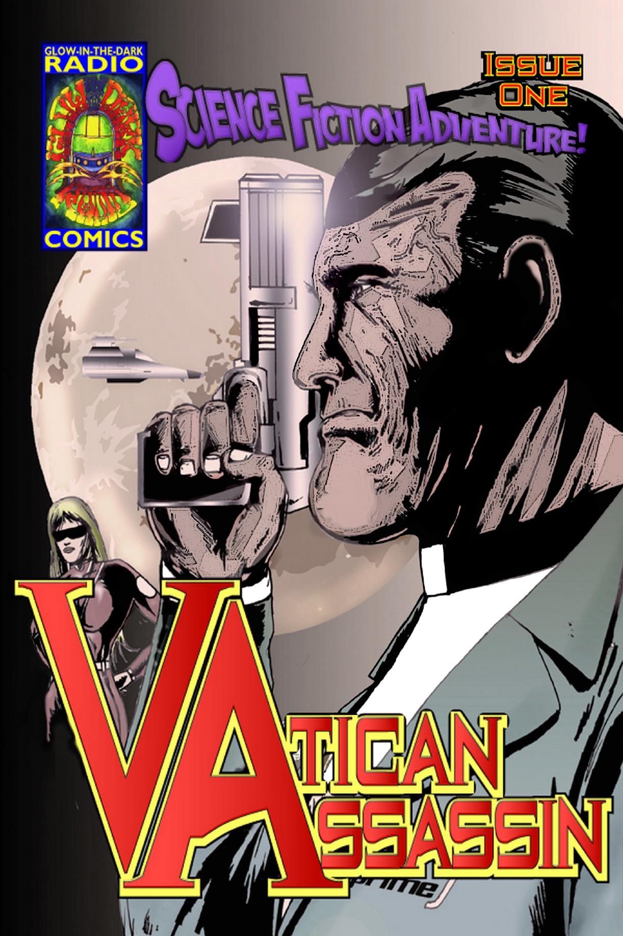
VATICAN ASSASSIN #1 Glow in the Dark Radio Comics
A few years back, Mike Luoma sent me a comic called HOLY SHIT OR PAT ROBERTSON IS THE ANTI-CHRIST. In my review, I tried very hard to be constructive, but ended up giving it a pretty negative review. Basically, I panned the book as barely a comic since it basically was a bunch of splash pages with text adorning either side of the page. The subject, as the title would indicate, was religion. And the whole thing left a bad taste in my mouth. After reading VATICAN ASSASSIN, Luoma’s follow-up, it appears that the writer took some time to gain understanding of comics. VA reads in a much clearer way, with a definite plot and a theme that may be appealing to some. In the future, the moon has become a hotbed of political and religious turmoil. The Muslim-dominated Mars colonies constantly pose a threat to the moon’s Catholic Church, forcing them to enlist a man known as BC, the Vatican Assassin. That’s the plot, and as you see, it’s of the religified variety. Religion is often a hard sell in comics, and I have to give it to Luoma for writing what he feels passionately about. The book is still as indie as you can get with capable and oft times nicely angled panels, suffering from the usual stiffness of characters that one often associates with indie books. VATICAN ASSASSIN is a much more digestible read than Luoma’s first book, and I have to commend the author for evolving and showing a lot of growth from his first project to this one.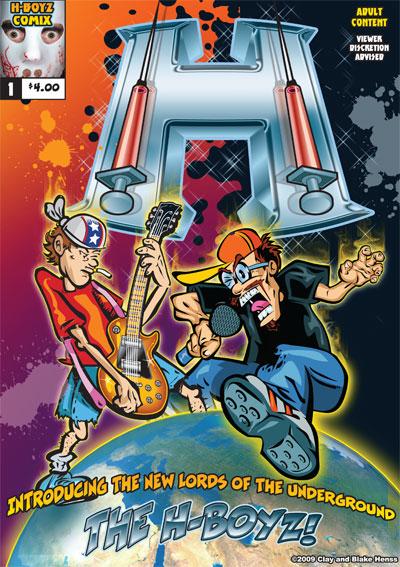
THE H-BOYZ #1 H-Boyz Comix
OK, if you’re looking for mature and sophisticated humor, look anywhere except in this comic. H-BOYZ is crude, it glorifies unprotected sex, while listening to rock n roll till your ears gush blood and shooting heroin into your balls, and it is completely unapologetic about it. For that, I have to applaud H-BOYZ for being nothing more than what it is; a natural evolution from Cheech & Chong and Bevis & Butthead. So if humor at its most base level appeals to you, H-BOYZ is the book for you. But if you’re easily offended by sex with the elderly, copious drug use of all kinds, and pants-upon-pants-fulls of every body fluid that you can imagine (and some you can’t), then you might want to give this one a pass.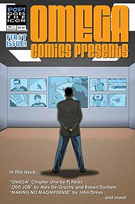
OMEGA COMICS PRESENTS #1 Pop Goes the Icon
An homage to MARVEL COMICS PRESENTS (a book Marvel can’t seem to recreate well these days), OMEGA COMICS PRESENTS offers a handful of stories of various genres by different talents. The good thing about a book like this is that if you don’t like a story, there’s another one down the pike that could be better. The bad thing is that sometimes you want more than what the 7 to 8 pages each story has to offer. Luckily for OMEGA COMICS PRESENTS, each of the stories in this premiere issue is pretty good. Story one entitled “Omega” by PJ Perez focuses on a team of anti-terrorists that work under the radar of the press and populace. This story may take a bit longer than I’d prefer to get started, but once the Omega team is introduced, the story really gets rolling and the tension is built high enough to make me want to check out the next issue. I loved the second feature “Odd Job” by Alex De-Gruchy & Robert Durham which is a different kind of ghost story. I really liked the mix of horror and humor in this one. And “Making No Magnifisnece” by John Dimes gets props for having a villain based on Charlie Chaplin. This story has some nice wispy art too. All in all, unlike Marvel’s most recent attempt at MARVEL COMICS PRESENTS which stunk at the get go, OMEGA COMICS PRESENTS reads more like those cool comics of old it was based after. Looking forward to issue #2.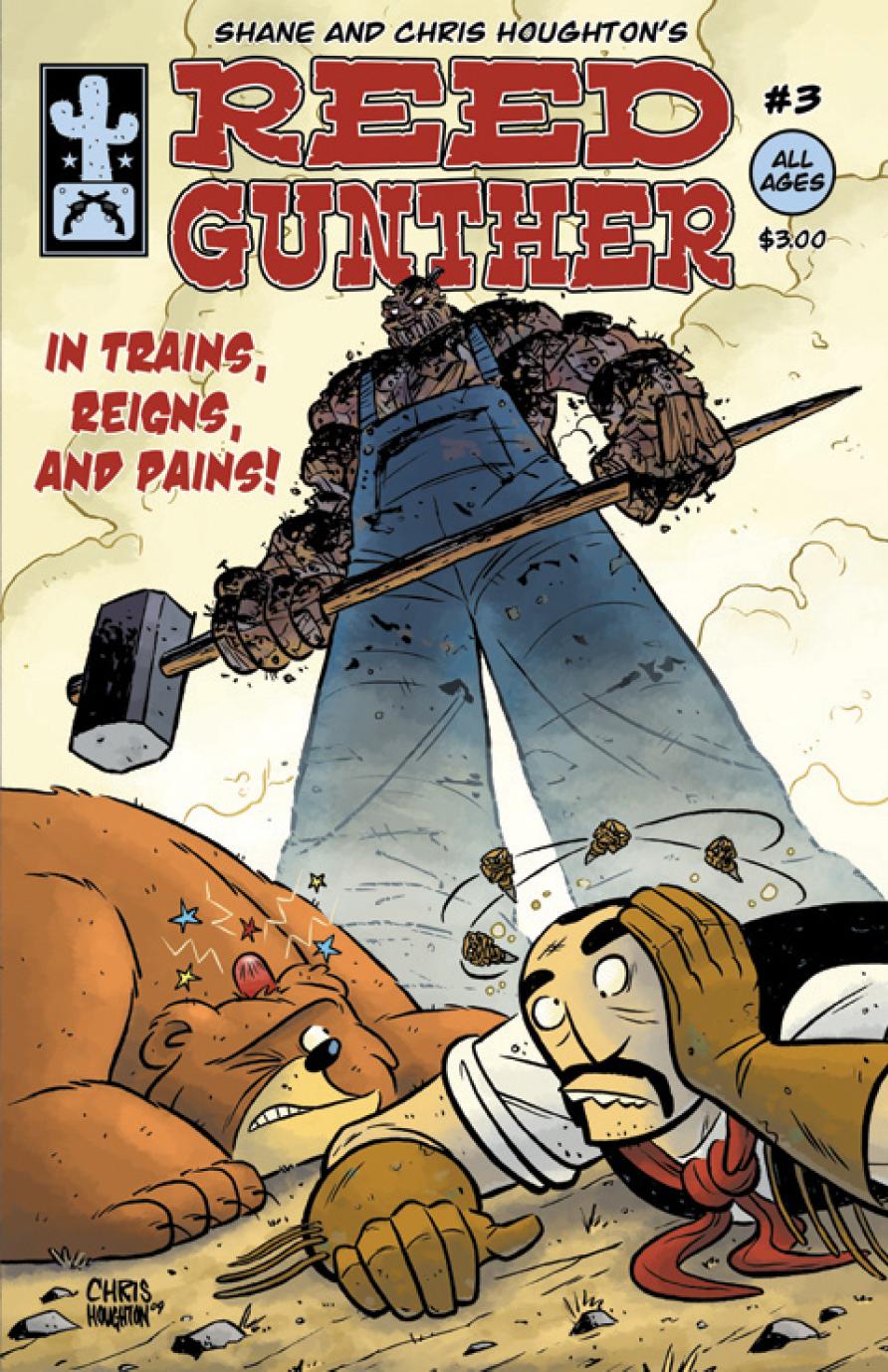
REED GUNTHER #3 www.reedgunther.com
What’s not to like about REED GUNTHER? He’s a bear riding cowboy. He’s traveling across America getting into adventures. He fights zombie John Henry on a train. Plus it’s got lines like; “Stop slapping me in the same place I was just punched!” I liked reading this issue because not in one panel was there something I was expecting or didn’t enjoy. Creators Shane and Chris Houghton do a great job of keeping the pace of the story moving, never forgetting to inject character and humor. This was a refreshing and kooky ride worth checking out in both its comic book form and online comic which can be found here.Ambush Bug is Mark L. Miller, reviewer and co-editor of AICN Comics for over eight years and one of the original @$$holes. Check out his comic book shorts from Cream City Comics’ MUSCLES & FIGHTS VOL.3 and MUSCLES & FRIGHTS VOL.1 on his ComicSpace page. Bug was interviewed here and here at Cream City Comics and here and here about his comic from Bluewater Comics, VINCENT PRICE PRESENTS: THE TINGLER #1-2. Look for more comics from Bug in 2010, including ROGER CORMAN PRESENTS DEATHSPORT in July, and the just announced vampire miniseries NANNY & HANK in August (and check out Jazma Online’s new interview with Bug about NANNY & HANK here). Bug’s latest comic is VINCENT PRICE PRESENTS #16: WITCHFINDER GENERAL on sale July 2010. Fanboy Radio recently interviewed Bug about it here.


OUTSIDERS #27 DC Comics
You know, I was really rooting for this comic. I know folks were bound to root against it simply because DC Head Cheese in Charge Dan Didio was writing it. The guy’s got a lot of flack thrown at him through the years, but I guess being the face of DC, he’s set up to have some tomatoes tossed at him. So after a promising first issue, I really wanted to give his second OUTSIDERS issue another positive review. But I can’t simply because of the really, really bad dialog. Some of the lines from this issue really sound like something two kids would verse back and forth while playing with action figures in a sand box. “Dude, if that’s the way you want it…BRING IT!” Really, Dan? Really? That’s the line you wanted to end this issue on? But I am still rooting for this book. I love the cast of characters and there are some things going on in this title that is sure to impact the rest of the DCU. My advice to Dan would be to play to your strengths. There were some kind of exciting beats in this issue and the last. If Didio relied less on the talky (which clearly isn’t his strong suit) and more on scenes that will shock you, I’d still be behind this book. Still not giving up on this book, but this second issue wavered and really showed what Didio needs to work on as a writer. - Bug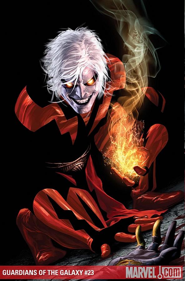
GUARDIANS OF THE GALAXY #23 Marvel Comics
Hoo doggy, another fine, fine issue of GOTG. Though I’m beginning to think that it’s impossible for Abnett and Lanning to write a bad issue. So this time, I’m going to focus on the art. Wes Craig has an offbeat style; one that I didn’t really like a lot when I first saw it. But something clicked in this issue. Craig was able to handle the dire tone of this story with maximum effectiveness despite the cartoony style to his panels. Yes, it’s Abnett and Lanning penning this fine, fine story, but Craig’s iconic panels amped the story to the nth degree. Can’t wait to see this fresh new artist evolve more on this title. - Bug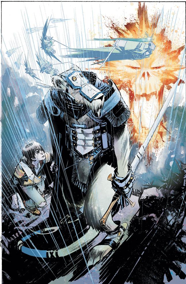
JOE THE BARBARIAN #2 DC Vertigo
This book, this right here is the kind of Grant Morrison I’d like to see more of. While I do love his head trips from time to time, I do absolutely tire of his “I guess 3 tabs of LSD wasn’t enough to get this fucking book” ramblings (I’m looking at you INVISIBLES Vol. 7 and THE FILTH). But this I like in its simplicity. I’m enjoying the ride that Grant is putting young Joe on, whether it is actually going on in his own head as a result of his condition combined with his introverted self, or if some mystical shenanigans really are afoot to have everything geek (Transformers and Space Marines and Batman, oh my) spill out in front of him. At the very least it’s a classic fantastical journey; at the most it could be the sad story of a kid who lost his dad and spends too much time within himself. Either way it’s rolling out nicely and looks absolutely stunning from the magic that Sean Murphy is working as well. Great stuff from top down that I’m jonesing for more of. - Humphrey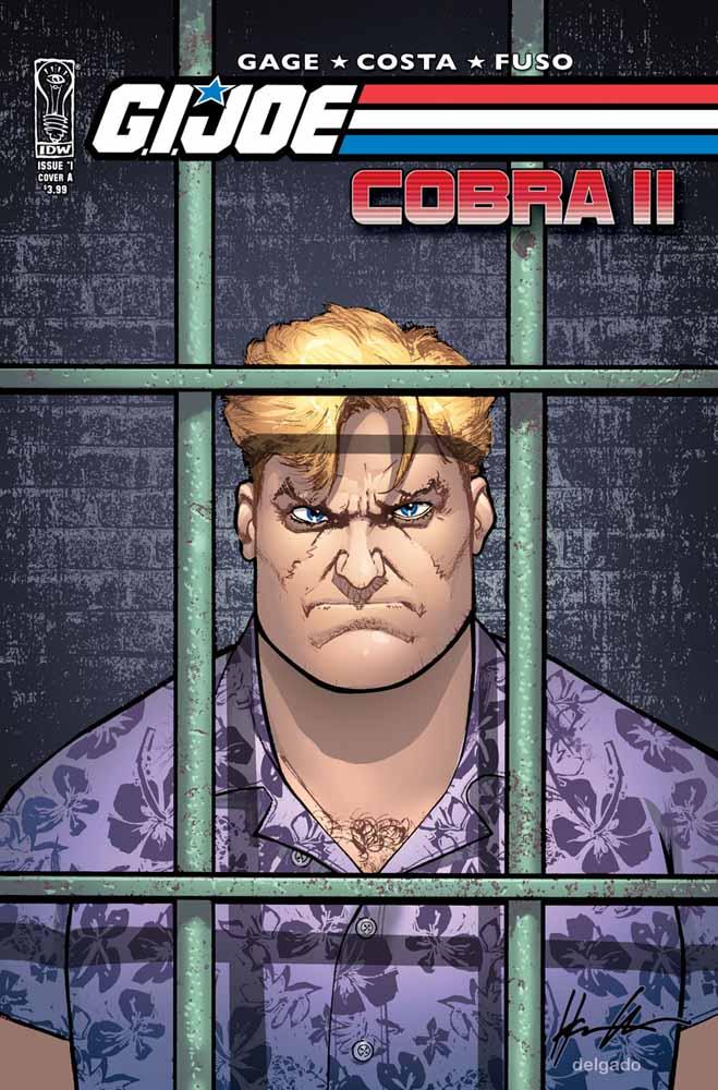
GI JOE: COBRA II #1 IDW Publishing
The best miniseries of last year gets a sequel and I totally miss it on the stands?!?! I gave myself deep bone bruises kicking myself for missing this one and devoured the book (with my eye-mouths, not my actual eating mouth, of course!) as soon as I got to my car after I left my comic shoppe. And those of you thinking that perfection can’t be reached twice in a row need to feast your eye-mouths on this book. Christos Gage and Mike Costa show us a GI JOE world on a level of sophistication never reached in a Joe comic ever before. Even insane concepts like Croc Master is handled in a realistic and haunting tone. The Joe fan in me wishes all of the GI JOE comics were this good. Last year, I touted this book as the best of the best. History is repeating itself here. This is a miniseries you cannot miss. Buy the first trade and then dive into this new series. I guarantee you will not be disappointed. - Bug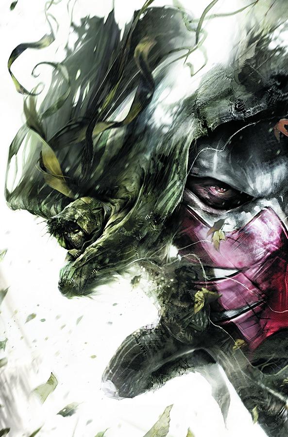
AZRAEL #5 DC Comics
I don’t normally buy AZRAEL. Sure I followed the original miniseries and a lot of the series afterward (though it went on and on and on waaaaaaay past it’s expiration date). But the idea of Azrael, avenging knight slicing through Gotham’s streets with swords of fire is a cool idea and I’ve always been a fan of Fabian Nicieza. But what made me pick up this particular issue was the appearance of Ragman on the cover. While my favorite Marvel character is Moon Knight, Ragman is definitely one of my faves in the DCU (must have a thing for hooded heroes I guess). Reading this issue made me recall a conversation I had with a friend recently. She was the only African American in a class full of Caucasian students. During the class, when matters of race would come up, all heads turned to her for her opinion as if she were the representative of her race. The feeling, as one would assume, was pretty uncomfortable for my friend. I wonder if that’s how Ragman feels (if a comic book character could feel, that is). Yes, we know that the Jewish culture is a big part of Ragman’s character, but does every story involving him have to revolve around that one aspect of him? The story was simply ok. I got to know the new Azrael, who appears to be a former cop. Azrael also has an ice sword which is pretty sweet. And the fact that Azrael’s powers are derived from ancient alchemy is a nice touch. But I groaned like a grizzly when I realized that this was another comic with a social message. What I wouldn’t give for a ballz-dirty actioneer starring Ragman like the miniseries that originally introduced the character to us many moons ago. I guess, I’ll just have to keep waiting for that Ragman to show up. He doesn’t here. - Bug